Making Complex Software Easy to Understand
Most event software assumes you will sit through a training session, memorize where everything lives, and call support when you forget. We think that assumption is the design failure, not you. You are running a dance competition, a festival, a studio — software should meet you where you are, in the middle of a busy week, and get you to the answer in seconds.
That belief shapes everything we build. Here are four features in Eventist that show what it looks like in practice.
Search that walks you to the exact button
Every dashboard has a lot of pages, and every page has a lot of buttons. Instead of making you learn the layout, we put a search bar at the top of the menu that understands plain English. Type "discount" — or even "who bought" or "how do I get paid" — and it shows two things side by side: the pages and buttons that do it, and the help guides that explain it.
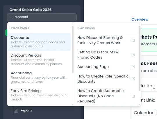
Here is the part we're most proud of: when you pick a result, Eventist doesn't just open a page and leave you to scan it. It takes you there, scrolls to the right spot, and puts a glowing highlight around the exact button you were looking for, with a short note about what it does. Search, teleport, spotlight.
A few quiet design decisions make this work:
- It speaks your language, not ours. Every entry is tagged with the real phrases people use — "coupon codes", "sell tickets at the door", "put the storefront on my website" — so you don't need to guess what we called the feature.
- It knows your event. A studio owner sees studio pages, a competition director sees divisions and scorecards, and nobody sees pages their role can't access.
- Help lives next to actions. Guides open in a separate tab, so reading the instructions never costs you the page you were on.
An assistant that does the work — with your approval
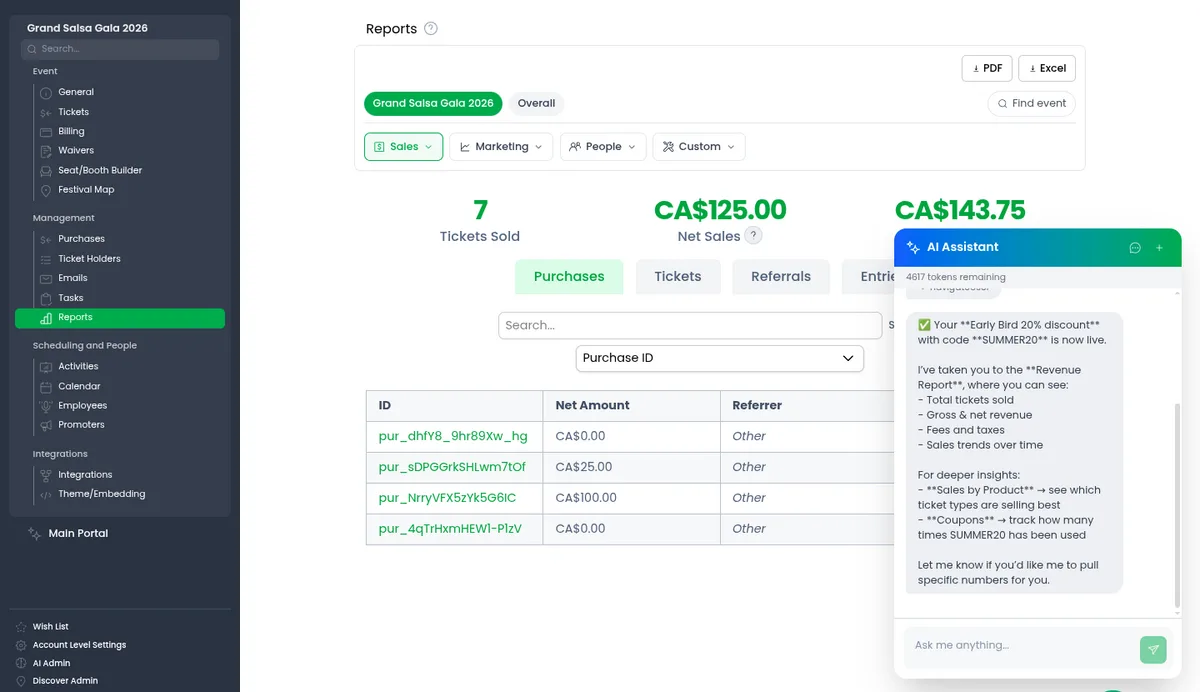
Search gets you to the button. Sometimes you would rather skip the button entirely. The AI assistant in the corner of the dashboard can set up tickets and discounts, build schedules, look up an attendee's registration, pull sales numbers, and take you anywhere in the app — all from one plain-English request.
The design question we obsessed over wasn't what the assistant *could* do. It was what it *should* do without asking. Our answer: nothing that changes your event. Anything that only reads information — a sales report, an attendee lookup — just happens. Anything that creates or changes something is shown to you as a plan first, and it waits for you to press "Do It".
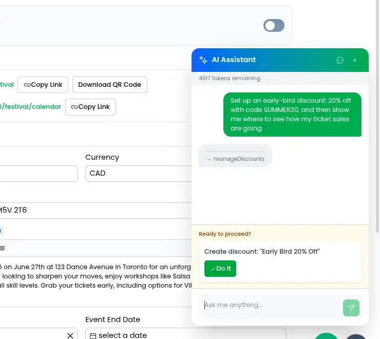
The assistant also chains steps together like a person would. In the example above, one request — "set up an early-bird discount, then show me how ticket sales are going" — became: create the discount (after approval), then navigate to the revenue report, then explain what's on the screen. And when it takes you somewhere, it highlights where you could do the same thing yourself next time. We want the assistant to teach you the software, not replace your understanding of it.
One more honest design choice: some things the assistant deliberately won't do, like deleting things. For those, it walks you to the button and lets you press it. A little friction in the right places is a feature.
A how-to video on every page
Written guides are great when you're searching for something specific. But when you land on a page for the first time, what you usually want is for someone to just show you around. So every page in Eventist has a floating play button that opens a short video walkthrough of that exact page — not a generic tour, the page you are looking at right now.
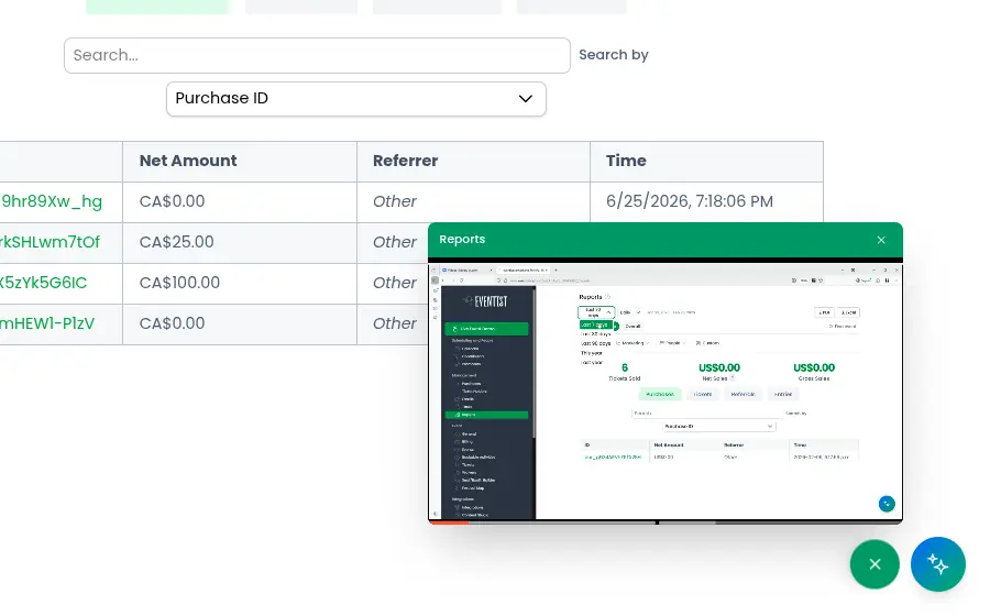
The video plays in a small window that you can drag anywhere and resize, and it keeps playing while you click around underneath it. That detail matters: the whole point is to follow along, pause, try it yourself, and un-pause — without ever leaving the page.
A wish list where users steer the roadmap
The first three features are about helping you use what exists. The fourth is about deciding what should exist. Every Eventist organizer has a Wish List page where you can request features, vote on other people's requests, and report bugs — and see our actual development roadmap, with requested features scheduled onto real dates.
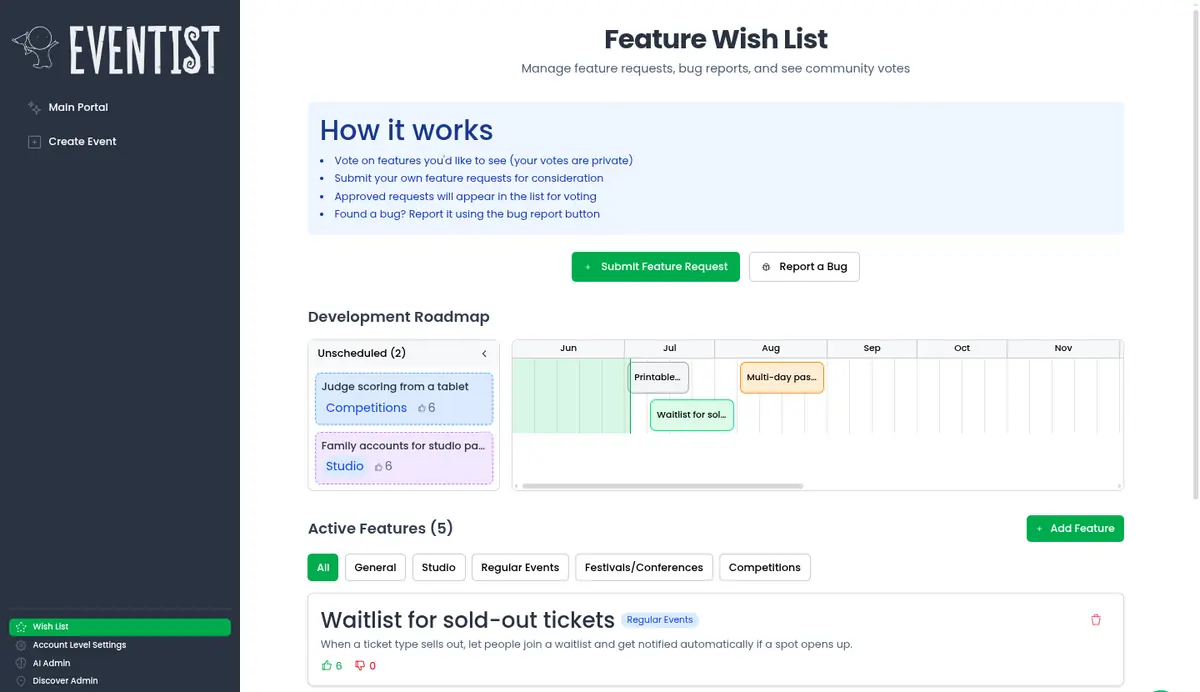
Two deliberate choices here:
- Votes are private. You can see what's been requested, but not the running tally. People vote for what they actually need instead of piling onto whatever is already winning.
- The roadmap is public. When we schedule a requested feature, it appears on the timeline for everyone. If you asked for it, you can watch it move from idea to planned to shipped.
A surprising amount of Eventist started life as a wish list entry. It is the cheapest, most honest research tool we have ever built.
The thread that ties it together
If there is one principle behind all four features, it's this: the software should carry the knowledge, so you don't have to. Search remembers where every button lives. The assistant knows the steps and shows them to you. The videos explain each page in place. And the wish list makes sure that what we build next comes from the people actually running events.
If that sounds like the kind of software you want behind your next event, take a look around or book a call — we would love to show you the rest in person.
Tags
Ready to simplify your events?
Join hundreds of organizers, studios, and festival directors who trust Eventist to run their events.