Search That Understands What You Mean: One Index Behind Our Search Bar and Our AI Assistant
Every event management platform faces the same problem as it grows: more features means more pages, and more pages means more time hunting for the one you need. A dashboard that runs a festival or a dance studio in Eventist has hundreds of pages and thousands of buttons. Most software answers this with a training session and a help wiki and hopes you remember where everything lives. We think the software itself should just take you where you asked to go, in your own words.
Ask on reddit which event ticketing platform is actually easy to use and the recurring complaint is rarely about missing features, it is about not being able to find the ones that are there. Nobody should have to *browse* for the button that refunds an attendee or opens the door sales report. They should be able to ask for it, plainly, and be taken straight there. This post is about the small piece of architecture that makes that possible for both the search bar and the AI assistant in Eventist.
Two front doors, one brain
There are two ways to ask Eventist where something is.
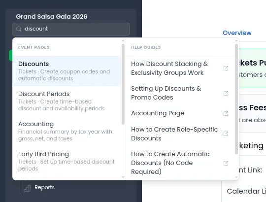
The first is the search bar at the top of the sidebar. It's a command palette: type a few words, get a ranked list of destinations and help guides, hit enter, and you're there.
The second is the AI assistant in the corner. You describe what you want in a full sentence ("set up an early-bird discount and then show me how sales are going") and it does the work, then walks you to the result.
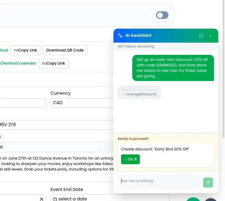
Those feel like two completely different features. Under the hood they are the same feature. Both read from a single navigation index: one flat catalog of every place a user can be sent, each entry carrying a stable key, a human label, a one-line description, the permissions it requires, and, most importantly, a bag of keywords, the real phrases people type when they mean that page.
That last field is the whole trick. "Refunds" lives under an entry tagged with "refund", "give money back", "cancel an order", "chargeback". You do not have to know we filed it under Purchases. You have to know what you want, in your own words, and the index meets you there.
The index doesn't care who's asking
The nicest property of the navigation index is that it has no opinion about what reads it. It is just data: a flat list of destinations, each with keywords, a description, and the permissions it requires. It does not know whether the thing querying it is a fuzzy-match search box, a large language model, or something we haven't built yet. That indifference is the whole point. Add a new destination once, tag it with the phrases people use, and *both* front doors can reach it the same day, along with any future one we bolt on.
This pays off in a place you might not expect: token cost. An AI assistant only knows what you put in its prompt, and every destination you describe to it is tokens you pay for on every single message. Because the assistant's list of places it can send you is *generated straight from the index* rather than hand-written into the prompt, we get the complete, current catalog in a compact, uniform shape, one line per destination, no prose. The model can reach every page in the app while we spend the fewest possible tokens describing them, and the list can never fall out of step with reality. Very cheap, very sleek.
And because both front doors filter through the same reachability check, a studio owner is never offered a competition-only page, a staff member with limited access is never shown a setting they can't open, and neither the search box nor the assistant ever points at a button the current user's role can't press. One list, defined once, kept honest for everyone who reads it.
Navigate first, verify for yourself
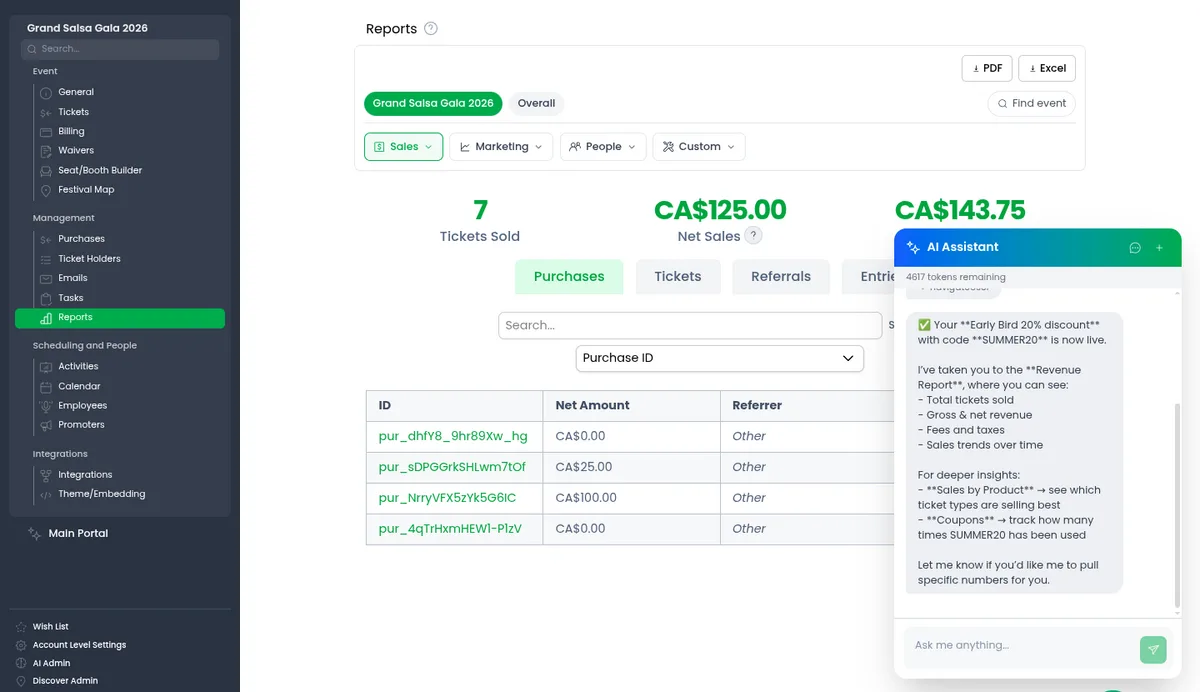
The consumer-agnostic index unlocks the design choice we're happiest with. When the AI assistant runs a function, creates a discount, updates a setting, pulls a report, it doesn't just tell you it's done and ask you to trust it. It uses the very same navigation index to *take you to the result* the instant the function returns, and rings the button or field it touched.
That turns "the AI says it made the change" into "you are looking at the change." The assistant did the work; you get to verify it with your own eyes, on the real page, one heartbeat later. There is no separate confirmation screen to build and no screenshot to render, because navigation was already a first-class thing the assistant could do, sitting right next to every other function in the same shared catalog. The cheapest, most trustworthy confirmation is the actual page.
Why it finds the right page from a half-typed query
Once both front doors share an index, the real question is: given a fuzzy, half-typed phrase, which result wins?
The search bar uses fuzzy matching with a deliberate weighting. Keywords outrank labels, because labels are short and generic, the word "ticket" shows up in a dozen of them, whereas the keywords are curated per destination and carry the phrasings people actually type. We also stopped rewarding matches just for appearing early in the text, because our keyword lists run long and an exact hit near the end of the list was getting buried under weaker matches near the front. Type "door sales", "coupon", "who checked in", and the right page rises to the top even though none of those words is its official name.
The AI assistant does the meaning-based version of the same job. Instead of matching letters it reads each destination's description, works out what you're actually asking for, and commits to a single destination. Because each destination has a stable identifier under the hood, we can rename its visible label whenever the wording improves without breaking anything, and when an identifier genuinely has to change we leave a redirect behind so older saved requests still resolve to the right page.
Search, teleport, spotlight
Finding the right page is only half of it. Dropping you at the top of a busy page and leaving you to scan it is the part most software gets wrong. So both front doors finish the same way. When you pick a result, Eventist takes you to the page, scrolls to the right spot, and puts a glowing ring around the exact button you were after, with a short note about what it does. The assistant does the identical thing after it finishes a task, so the next time you can do it yourself.
That is the quiet idea behind the whole design. The software should carry the knowledge of where everything lives, so you never have to. Whether you type your question into a search box or say it in a full sentence to an assistant, you are talking to the same brain, and it walks you to the same button.
If that sounds like the kind of software you want running your next event, take a look around or book a call. We would love to show you the rest.
Tags
Ready to simplify your events?
Join hundreds of organizers, studios, and festival directors who trust Eventist to run their events.